Ria
Overview
Ria is a companion app designed to help older adults capture memories, stay connected with loved ones, and receive gentle support in everyday life. At the same time, it gives families and care teams better visibility, richer context, and more coordinated ways to support the person at the centre of care. The live product positioning frames RiA around three core outcomes: preserving memories, driving engagement, and enabling preventive care.
My role
UX/UI Designer
Scope
UX strategy, information architecture, role-based journeys, wireframing, interface design, accessibility thinking, and product experience design
Focus
Multi-user companion app for storytelling, wellbeing support, and family care coordination
The challenge
Ria was not a simple single-user app. It had to balance emotional, social, and practical needs in a single product.
For older adults, the experience needed to feel easy, warm, and unintimidating, especially for users with lower digital confidence or accessibility needs. For families, it needed to create peace of mind and more meaningful participation. For care teams, it needed to surface useful context about the person behind the care, not just functional or medical information. The website makes this especially clear by describing Ria's value for storytellers, care teams, the next generation, and grandchildren.
The design challenge was to bring together:
Memory capture and storytelling
Intergenerational connection
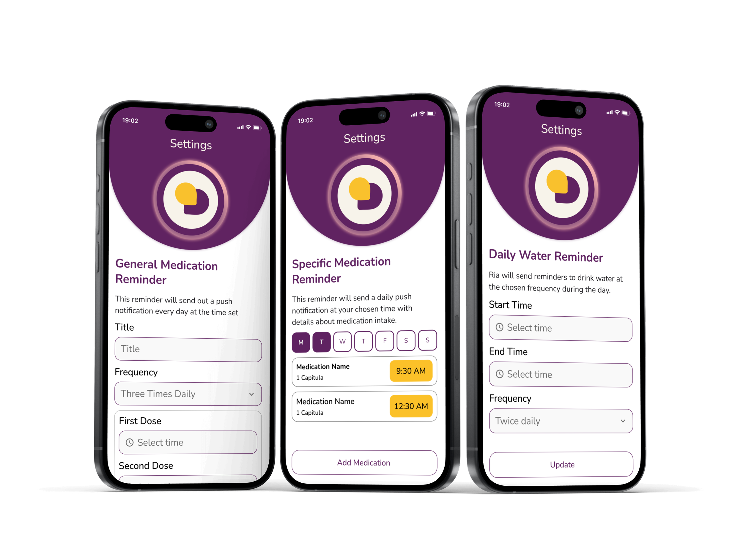
Reminders and daily support
Care coordination and visibility
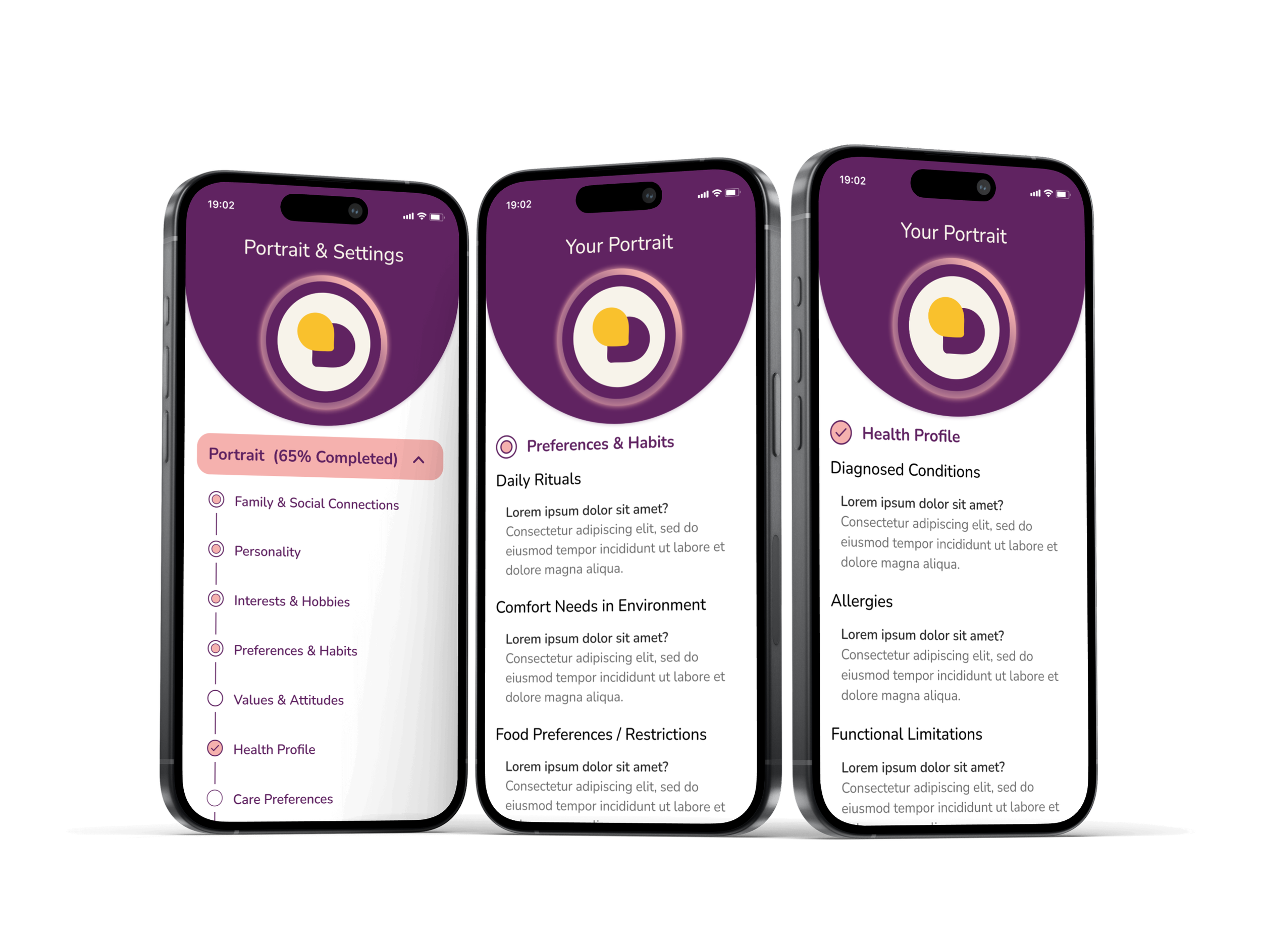
A living portrait of preferences, dislikes, and wishes
Multiple users with different roles, responsibilities, and permissions
The problem
The existing service model involved multiple moving parts, which created several UX challenges.
1. Storytelling alone was not enough
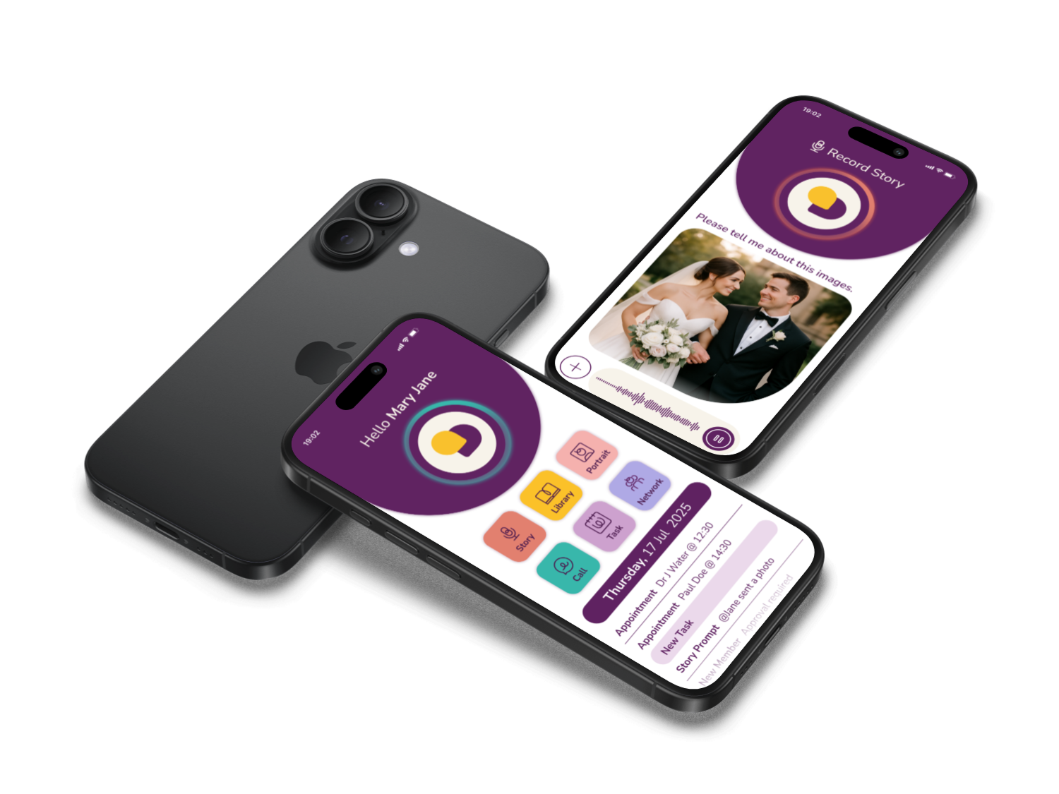
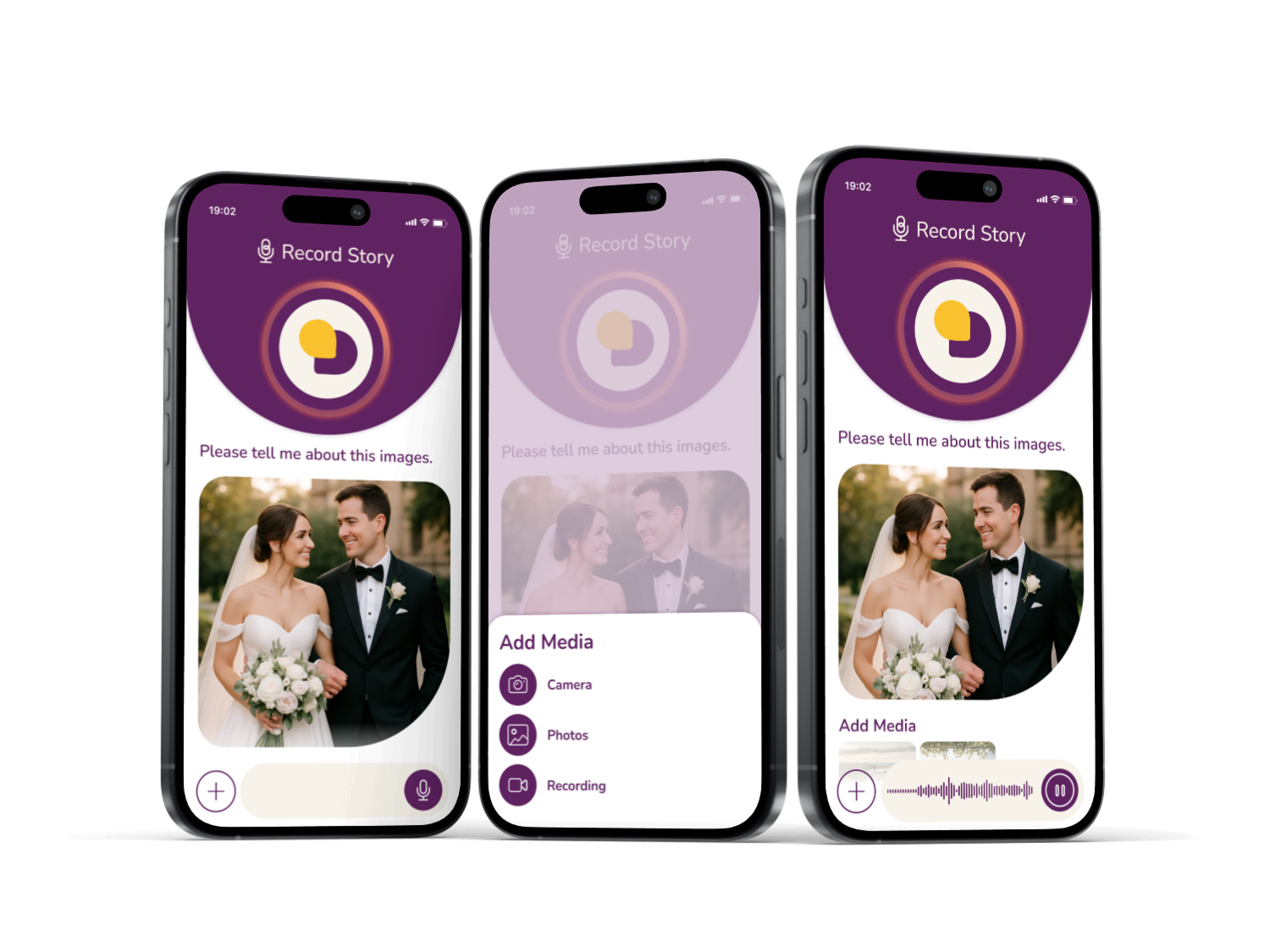
RiA’s value was never just about recording memories. The platform also needed to support video calls, reminders, shared coordination, and portrait-based care context. That meant the product had to connect emotional and functional moments in a way that felt natural rather than fragmented.
2. Elderly-first usability needed to be built in from the start
The product had to support older adults in a way that felt empowering rather than patronising. Simplicity, readability, clarity of action, and low-friction interaction were essential. Research into elderly mobile app use reinforced the importance of accessible navigation, clear feedback, and reduced cognitive load.
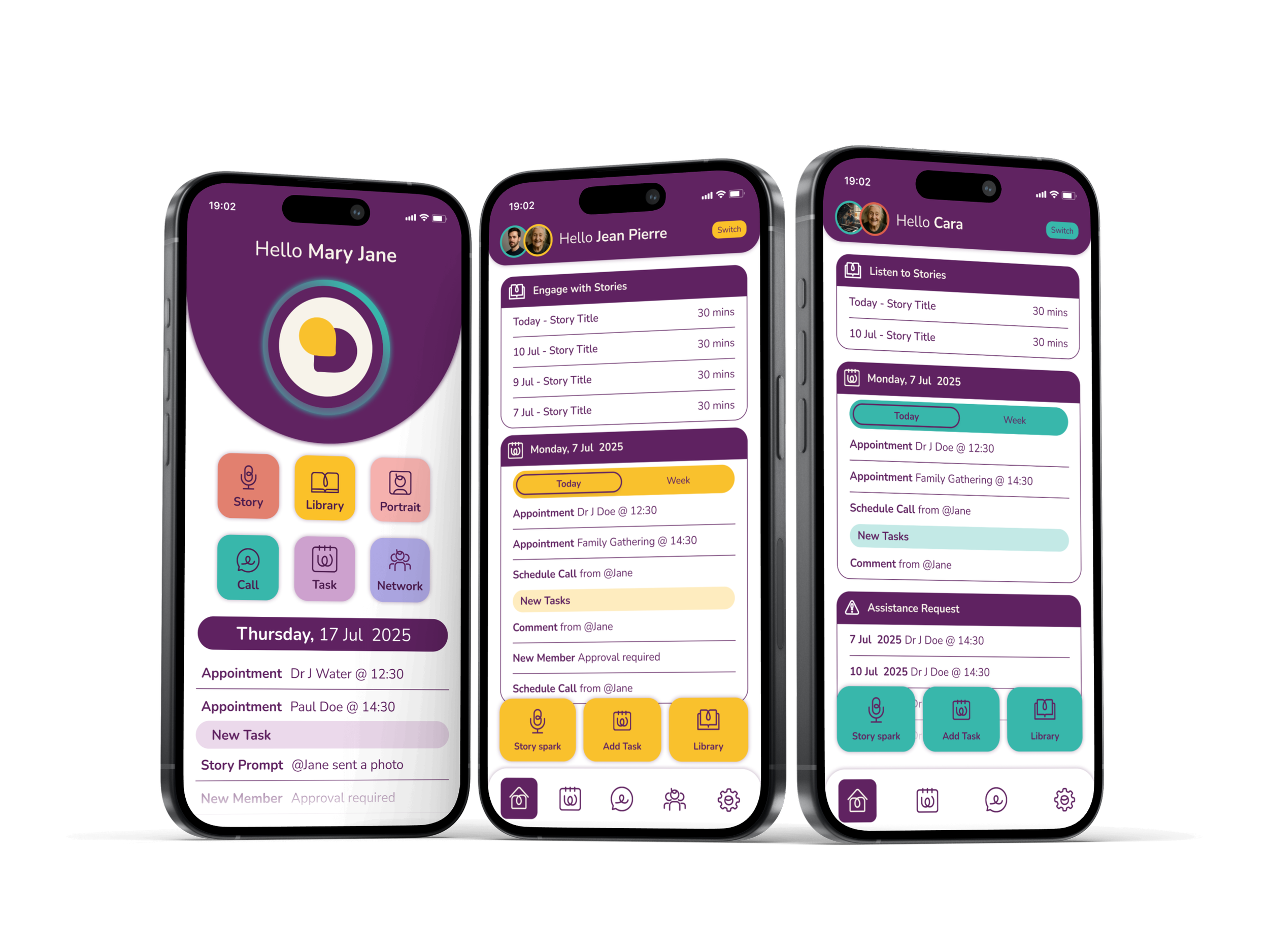
3. Care is shared, but trust is sensitive
RiA includes multiple roles, including User, Admin, Network Member, and Power of Attorney, with different permissions and responsibilities. Because the platform touches personal stories, portrait information, and support coordination, the UX needed to make trust, privacy, and access control feel understandable and intentional.
4. Family participation needed to feel meaningful, not administrative
The product had to help families and friends contribute in simple, emotionally valuable ways. The live site highlights this particularly well through the idea that grandchildren can listen to stories “like a family podcast”, while children and friends can respond and join in over time.
Goals
The design direction aimed to create a product that was:
Make the product easier for older adults to use independently
Support richer storytelling and family engagement
Create a clearer structure for reminders, portraits, and support tasks
Build trust through role-based access and permission logic
Make care feel more personal through a portrait-led context
Create a scalable product foundation across multiple user types
My approach
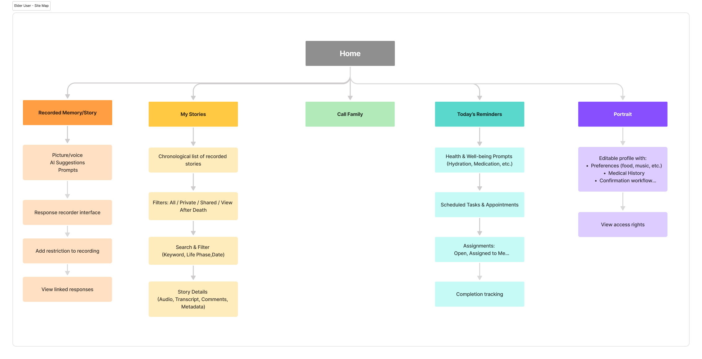
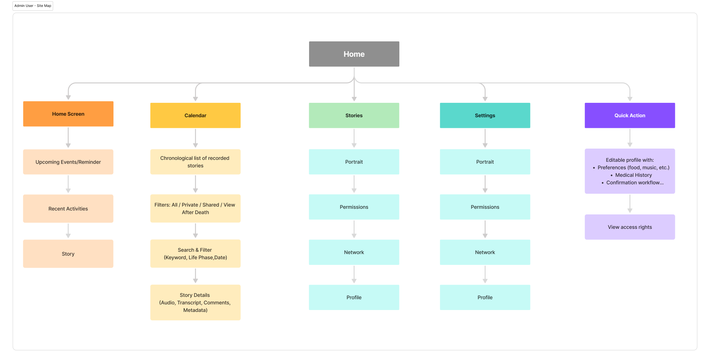
1. Designed around real user roles
I structured the experience around the needs of the storyteller, family members, support networks, and care teams.
2. Simplified key journeys
I worked to reduce friction across onboarding, story capture, reminders, portrait creation, and network participation.
3. Balanced warmth with structure
The interface needed to feel supportive and human, whilst still helping users manage practical actions and information.
4. Treated trust as part of the UX
Role-based permissions, visibility, and access control were central to the experience, not just backend logic.
Solution highlights
1. A clearer product ecosystem
I structured the experience around the needs of the storyteller, family members, support networks, and care teams.
3. A living portrait for more person-centred care
Portraits create a richer view of the individual by capturing preferences, dislikes, wishes, and personality traits, helping support feelings of respect and humanity.
2. Voice-led storytelling and memory capture
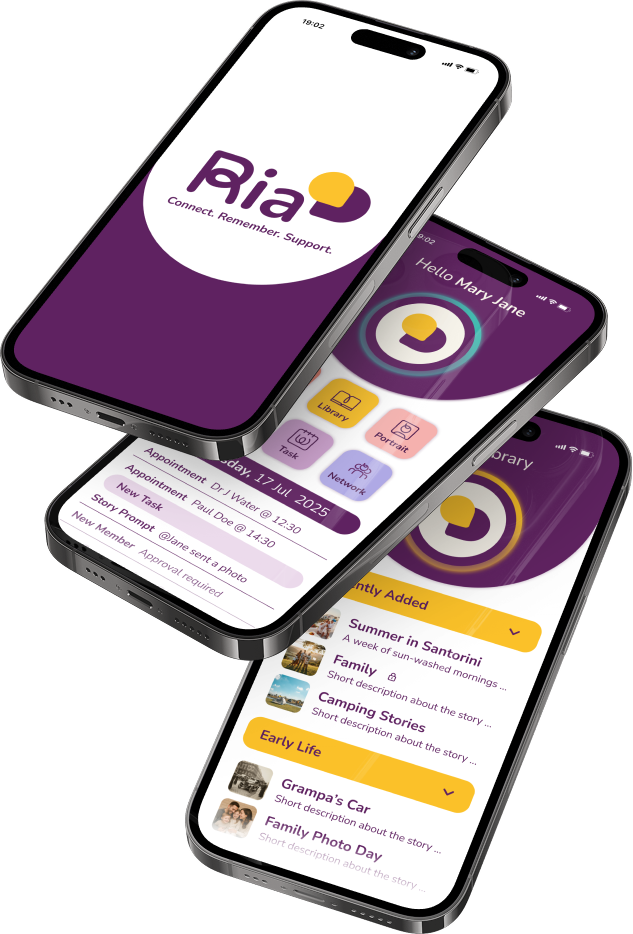
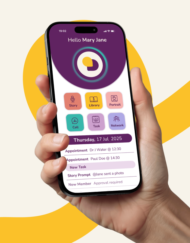
Ria supports more natural story-sharing, helping older adults record their memories in a way that feels easy and meaningful.
4. Gentler everyday support
Reminders, calls, and shared visibility help families support everyday wellbeing in a lighter, more organised way.
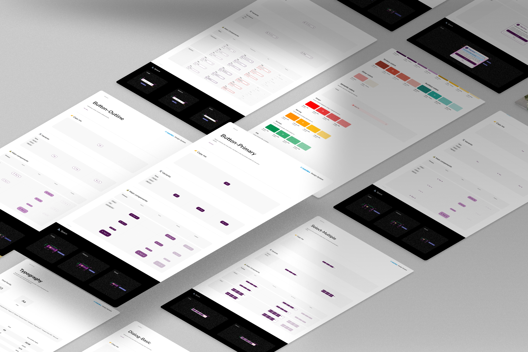
Design system thinking
Because Ria spans different features, roles, and levels of digital confidence, consistency was essential. I approached the interface with a system mindset, using repeatable patterns across story capture, reminders, portraits, calls, and support tasks.
Accessibility was also a core part of the design approach. For an elderly audience, clarity, hierarchy, visibility, touch comfort, and supportive interaction patterns all needed to work together to reduce cognitive load and increase confidence.
Outcome
The result was a clearer and more human-centred product direction for a complex, emotionally sensitive service. The work helped position RiA as more than a memory app by defining a stronger foundation for storytelling, everyday support, family connection, and portrait-led care.
Because the live product is still presented as in development, this case study is best framed around product direction, UX thinking, and the impact of experience design rather than on launched metrics. The public site currently invites users to sign up for updates ahead of availability.