
RE/MAX - Print & Outdoor - 'We're No. 1 because we get straight to the point'
The Brief
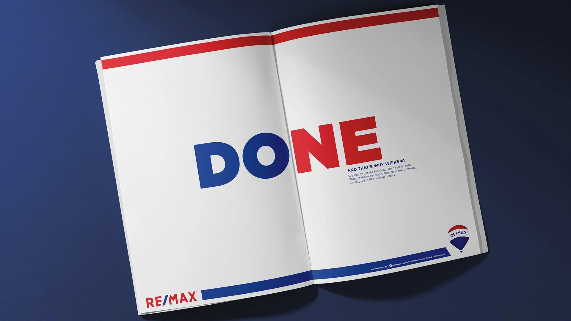
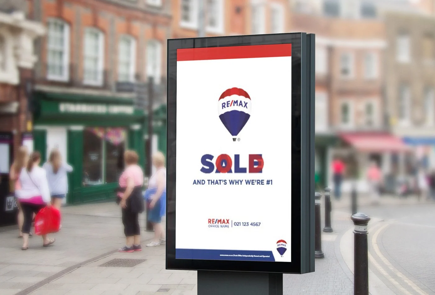
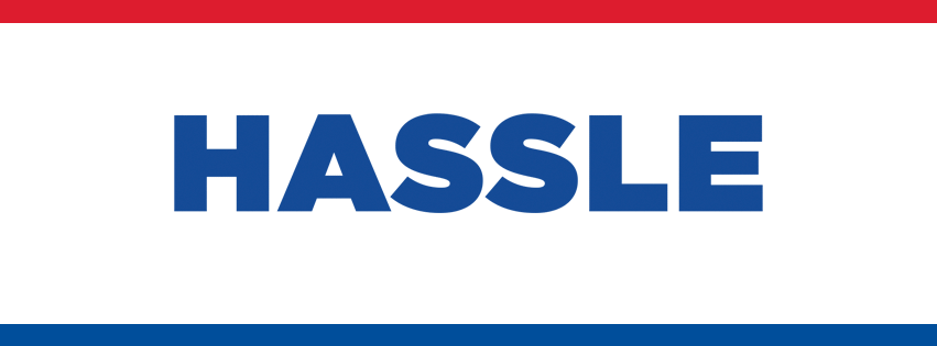
Develop an advertising concept for RE/MAX that reflects the brand’s straightforward, results-driven approach. The communication needed to reinforce the idea that RE/MAX is the No. 1 choice because it gets the job done simply and efficiently, without unnecessary fuss or complication.
Solution
We translated this strategic insight into an advertising idea that cuts straight to the chase. By keeping the messaging clear, direct, and uncomplicated, the campaign mirrors the RE/MAX experience itself: no frills, no confusion, just effective results. This creates a brand message that feels confident, accessible, and aligned with what makes RE/MAX stand out as a market leader.
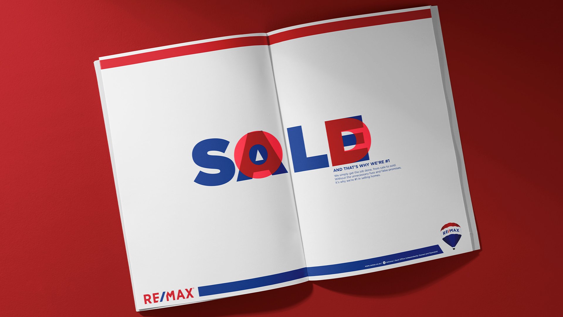
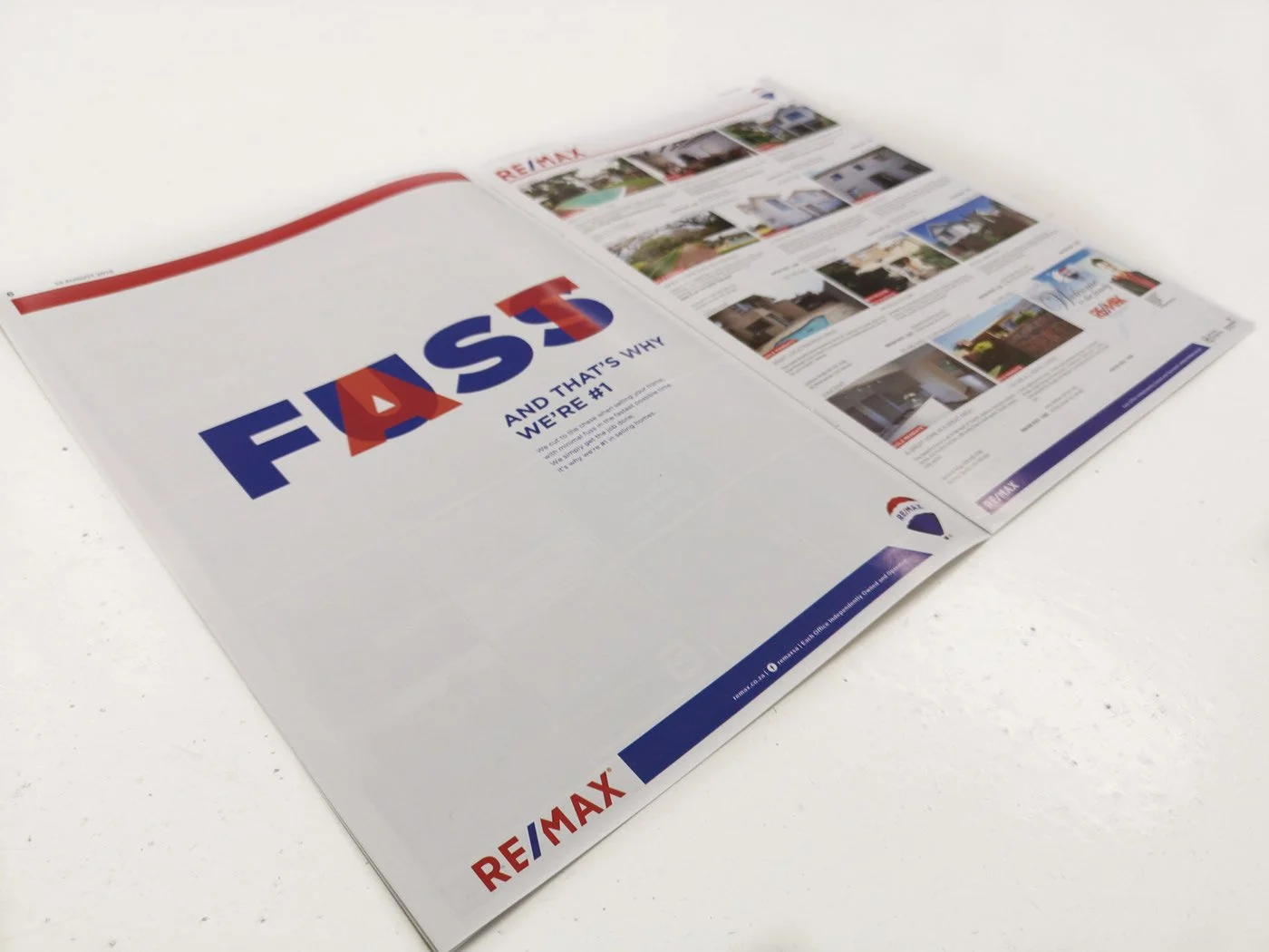
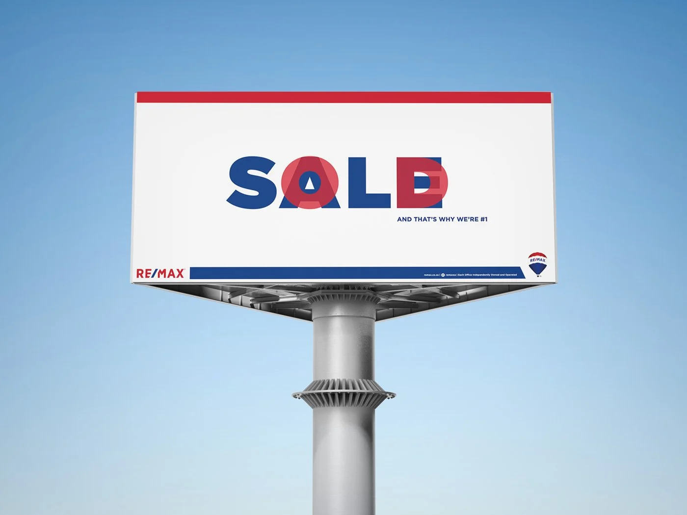
Print and Billboards
The first element examined was the brand identity and wine labels. We updated the font to a sans-serif font and added a bolder, more modern logo.
Online banners and Social Media
The use of motion to help create the online elements to carry through the concept.
Agency: 3Verse Copy: Kathleen Jonas & Claire Tanner-Roberts
AD: Charne Alexander & Lea Terblanche JAD: Peni Buckton ECD: Ivan Johnson Integration Director: Joanne Stone
Production: Raygaanah Kippie Strategy: Kay Orlandi
Client Service Director: Andrew Alexander