PhagoSense
Project snapshot
Overview
PhagoSense needed a digital product experience that could support complex experimental workflows without overwhelming the user. The platform had to guide researchers through multi-step processes, surface important information clearly, and create a more structured experience across analysis, setup, and results.
My role
Lead UX/UI Designer
Scope
UX strategy, information architecture, user flows, wireframes, interface design, design consistency,
and scalable system thinking
Focus
Reducing cognitive load, improving navigation, and creating a more intuitive experience
for a specialist scientific platform
The challenge
Scientific tools often require users to work through detailed processes, dense information, and specialist terminology. In the case of PhagoSense, the product needed to support technically complex tasks whilst still feeling usable and coherent.
The key challenge was not to simplify the science, but to simplify the experience of working through it.
The design needed to address:
Complex multi-step workflows
High cognitive load
Dense information structures
Usability for both new and experienced users
Consistency across the platform
The problem
The existing experience risked creating friction in several areas.
Lengthy workflows
Users needed to move through multiple stages of setup and analysis, which could feel demanding and difficult to track without a clearer structure.
Information overload
Large volumes of technical content, inputs, and outputs made it harder for users to quickly identify priorities.
Inconsistent interaction patterns
Without a more unified design language, the product risked feeling fragmented across the experience.
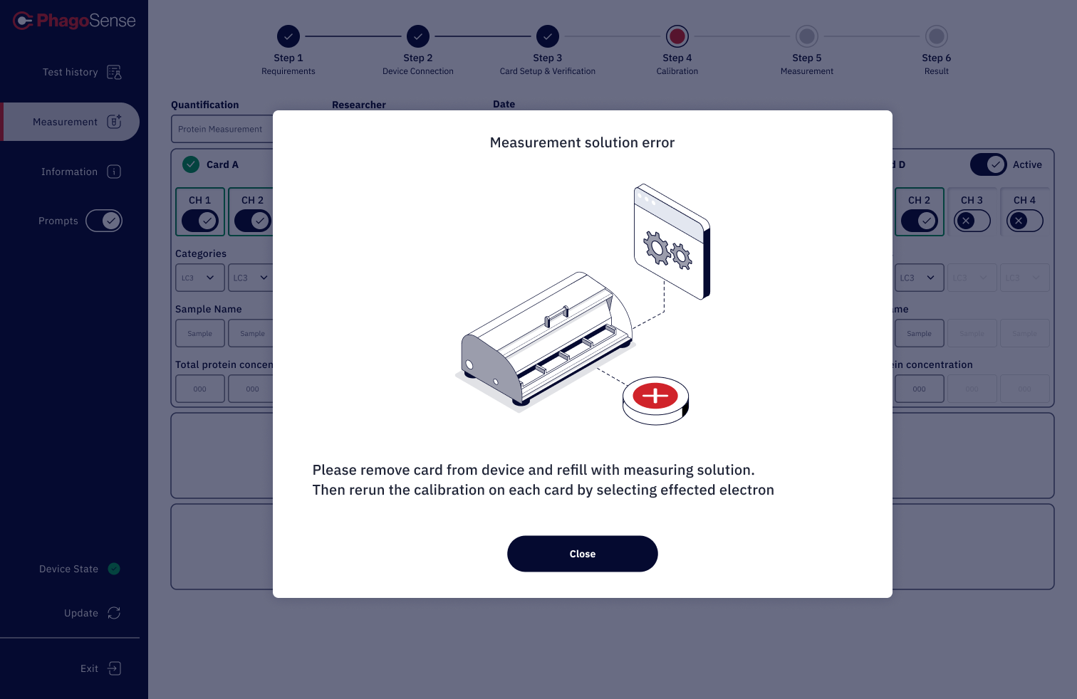
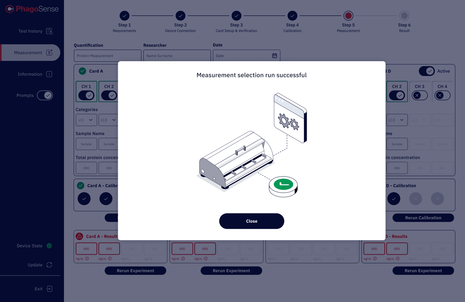
Confidence and clarity
Because this was a specialist scientific tool, the interface needed to feel trustworthy, precise, and easy to follow at every step.
Goals
The design direction focused on creating a product experience that felt:
Clearer in structure and hierarchy
Easier to move through multi-step workflows
Consistent across screens and interactions
Accessible for users with different levels of expertise
Credible as a specialist scientific platform
My approach
I approached the product by looking at how to reduce friction without reducing depth.
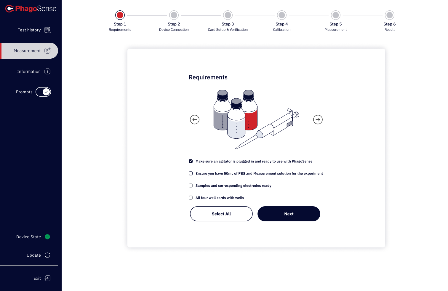
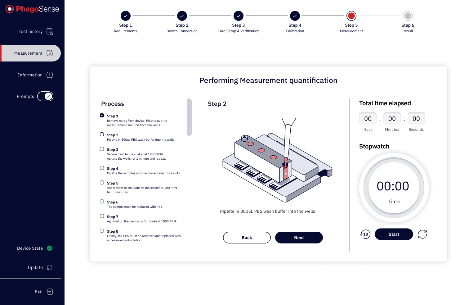
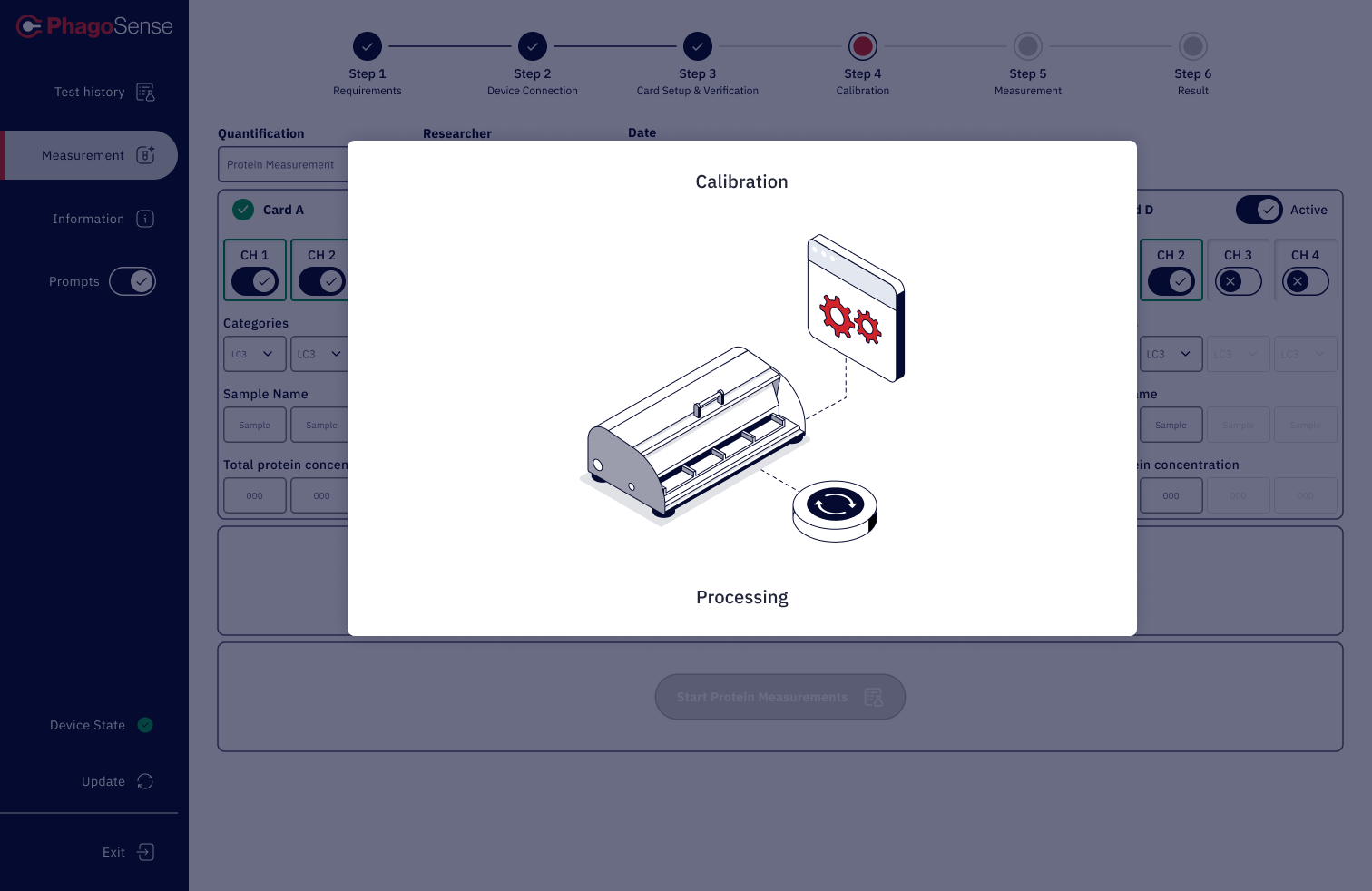
1. Create stronger workflow guidance
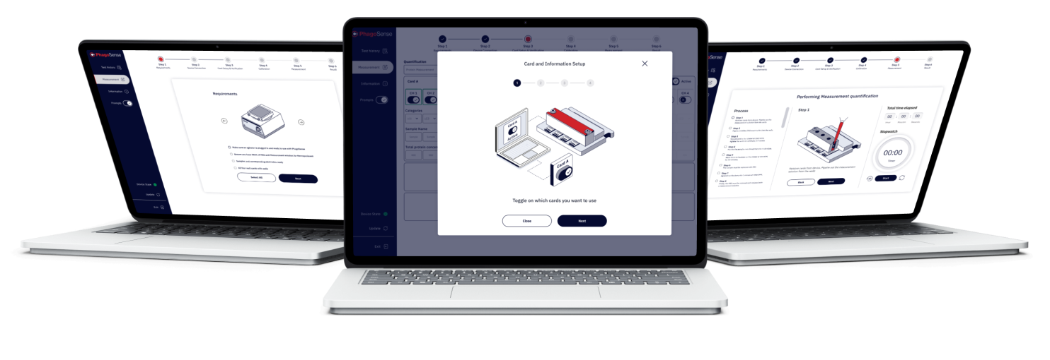
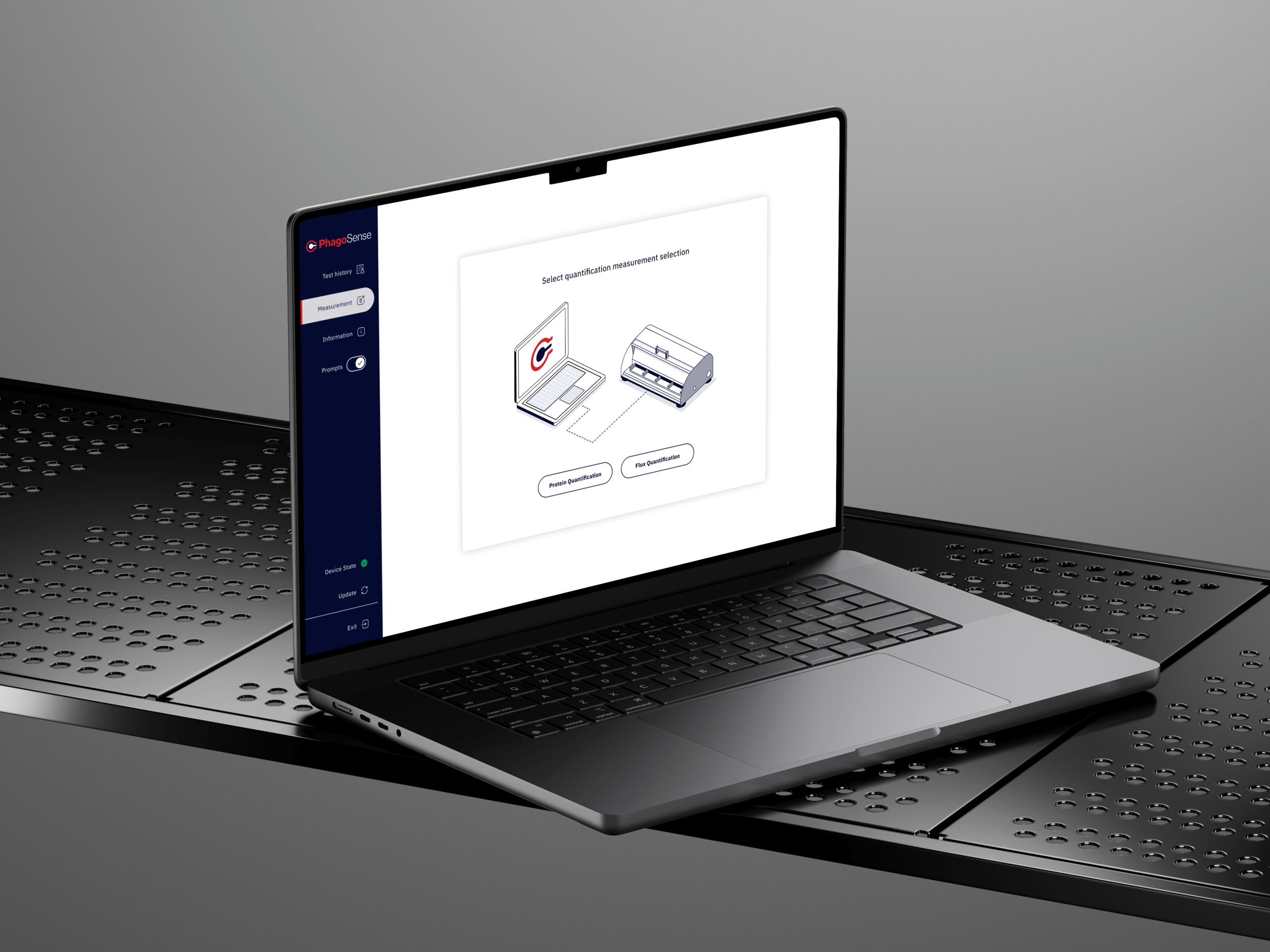
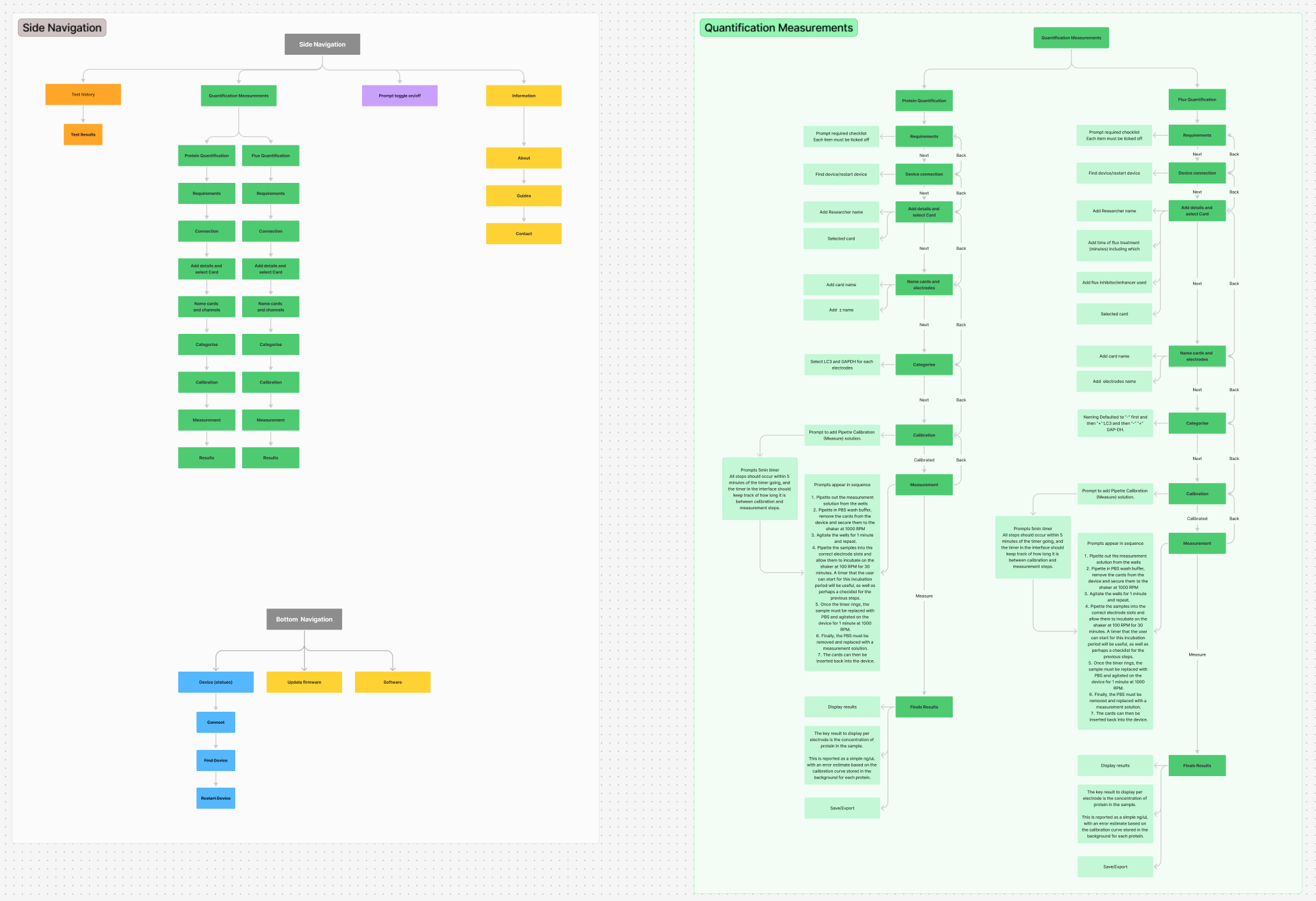
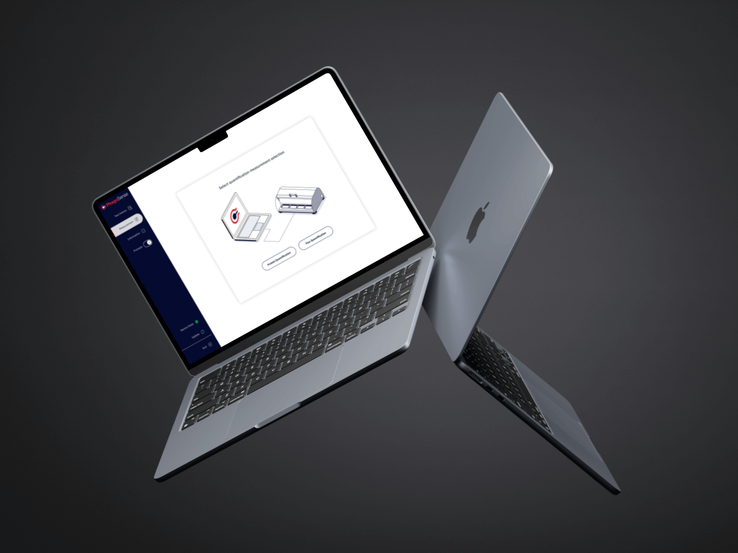
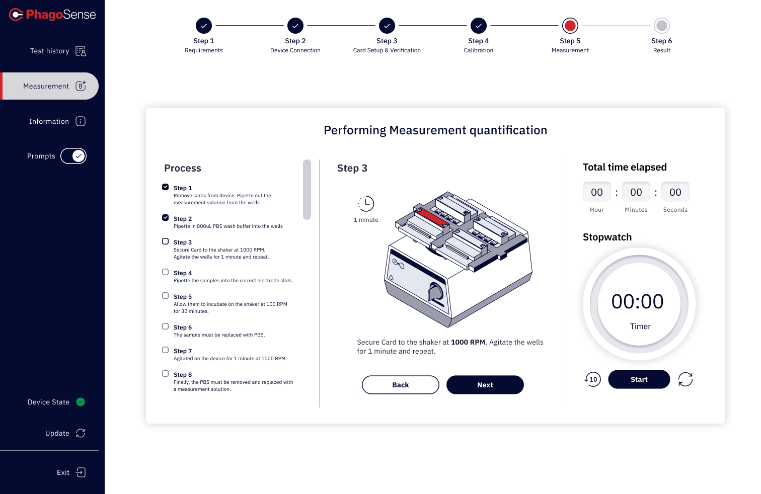
Complex processes were broken into more manageable stages using clearer sequencing, guided progression, and stronger visual cues.
2. Improve information hierarchy
Content, actions, and analysis areas were prioritised more deliberately so users could focus on what mattered most at each point in the journey.
3. Design for consistency
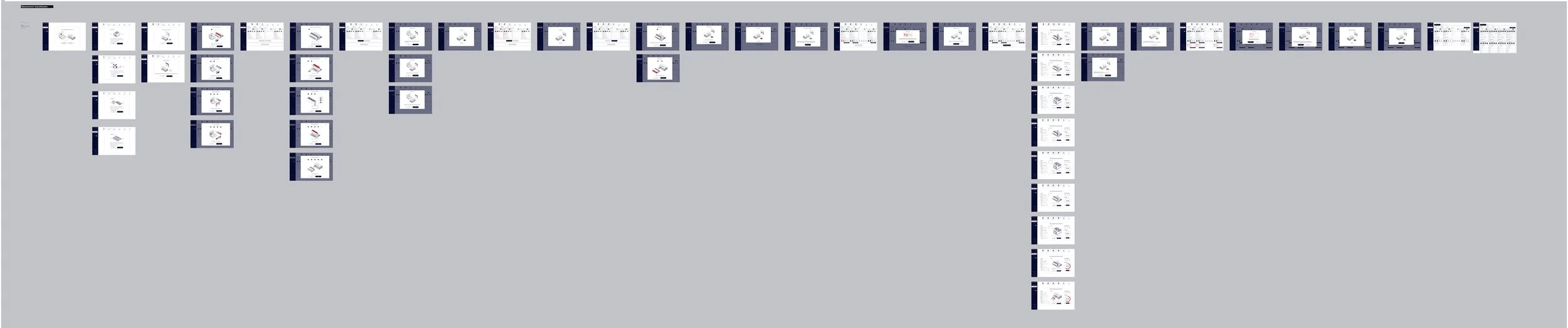
Reusable UI patterns, aligned interactions, and a more systematic visual language helped create continuity across the platform.
4. Balance technical rigour with usability
The interface needed to feel precise and professional, but not intimidating. The goal was to support serious scientific work through clarity rather than visual excess.
Solution highlights
Guided multi-step workflows
I introduced a clearer structure to help users understand where they were in the process, what had been completed, and what came next. This reduced the sense of fragmentation across longer tasks.
Clearer information architecture
The product was reorganised around a stronger hierarchy, progressive disclosure, and clearer content grouping so that users could scan and interpret information more effectively.
More intuitive interface patterns
A more consistent UI language helped reduce unnecessary friction and made repeated interactions easier to learn and use.
Improved readability and focus
Spacing, typography, layout, and interface structure were refined to improve legibility and reduce cognitive load across dense screens.
A more scalable design foundation
The work helped establish a clearer visual and interaction system that could support future product growth and more consistent implementation.
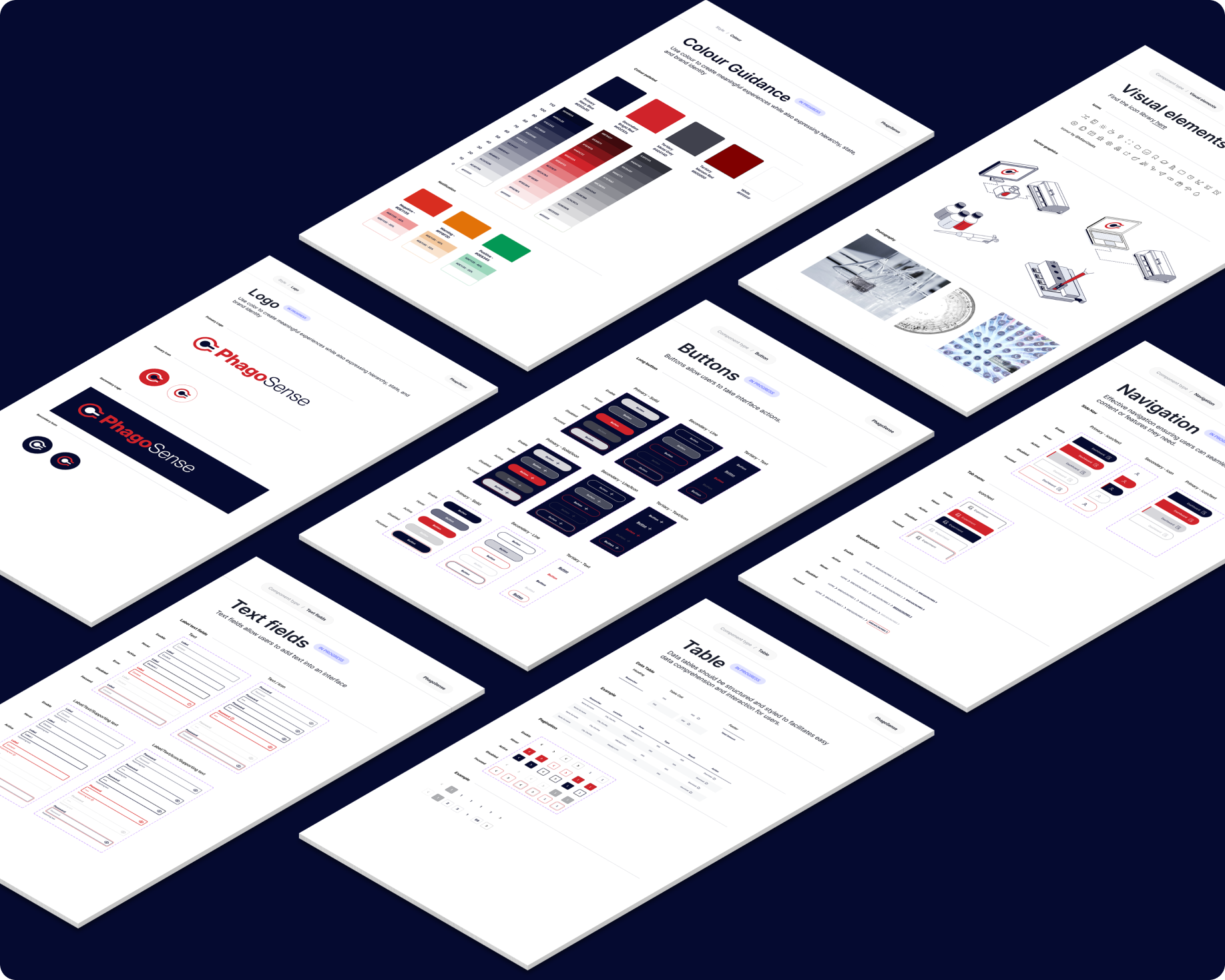
Design system thinking
A core part of the project was creating a more coherent product language across the platform.
This included:
Cleaner and more restrained visual system
Consistent component behaviour
Clearer typography and hierarchy
Improved spacing and layout logic
Reusable patterns for forms, navigation, and content blocks
Visual consistency across workflows and analysis views
This systems approach helped the interface feel more reliable, easier to use, and more scalable for future development.
Outcome
The result was a more structured and user-friendly design direction for a technically demanding platform.
The redesigned experience created a stronger foundation for:
Navigating complex workflows with more confidence
Reducing friction across detailed processes
Making dense information easier to interpret
Improving consistency across the product
Supporting both usability and scientific credibility