MyResidence
Project snapshot
Overview
MyResidence operates in a high-complexity service environment, where accommodation, relocation logistics, and ongoing support must work together seamlessly. The platform needed to help manage large volumes of information, maintain consistent standards across multiple locations, and create a smoother experience for people navigating a major life transition.
My role
UX/UI Designer
Scope
UX thinking, information architecture, user journeys, wireframes, interface design, usability improvements, and design consistency
Focus
Creating a clearer, more structured platform experience for accommodation discovery, relocation support, and service coordination
The challenge
Relocation is not just a booking task. It is a multi-step, high-stakes experience involving housing quality, coordination, documentation, transport, support services, and trust.
For MyResidence, the core challenge was designing a digital experience that could support:
large-scale accommodation management
consistent standards across different cities
complex logistics and support workflows
secure and reliable communication
a user experience that felt dependable during a stressful transition
The live page already identifies the operational difficulty of housing dozens to hundreds of assignees, maintaining quality standards, coordinating logistics, and ensuring safety and comfort.
The problem
The existing service model involved multiple moving parts, which created several UX challenges.
1. Complex accommodation decisions
Users needed to review housing options across different cities, with confidence that standards would be consistent and clearly communicated.
2. Fragmented relocation information
Accommodation was only one part of the journey. Users also needed visibility into transport, support services, documentation, and local guidance.
3. High trust requirements
Because relocation involves comfort, safety, and significant personal disruption, the platform needed to feel credible, reassuring, and well-structured.
4. Balancing scale with personal support
The service had to operate efficiently at scale without losing the sense of care and responsiveness that users needed during relocation.
Goals
The product direction focused on creating an experience that felt:
Clearer across accommodation and relocation workflows
More structured in how information was organised
More reassuring for users making high-stakes decisions
More consistent across locations and service touchpoints
More efficient for navigating complex support needs
My approach
I approached the platform by focusing on clarity, trust, and coordination.
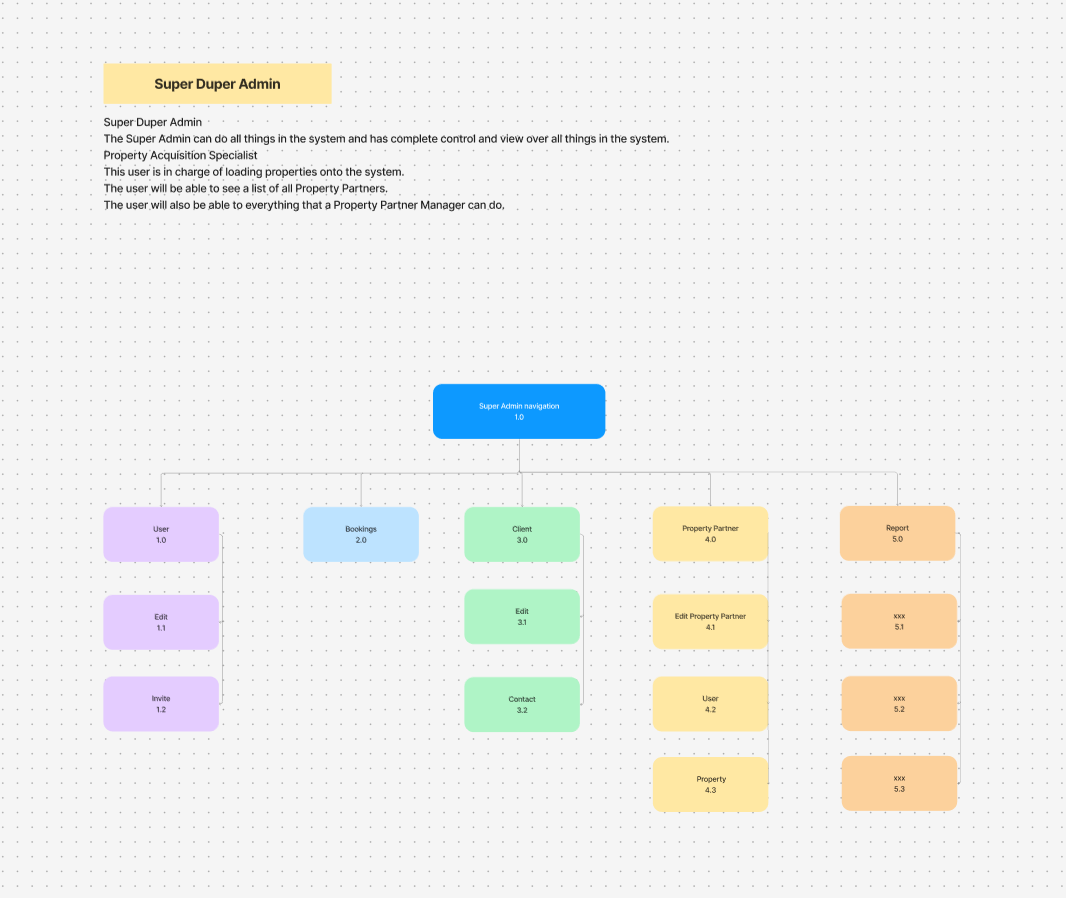
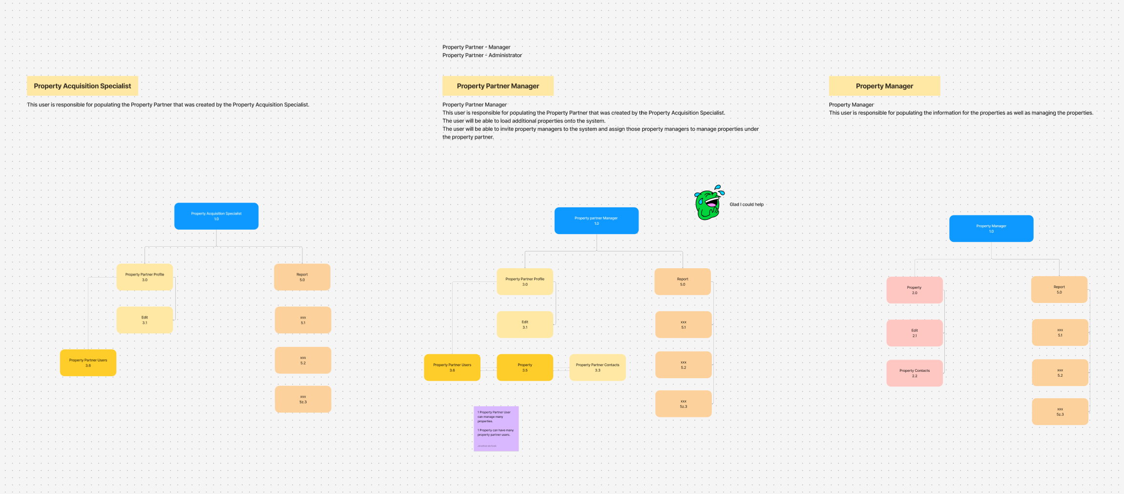
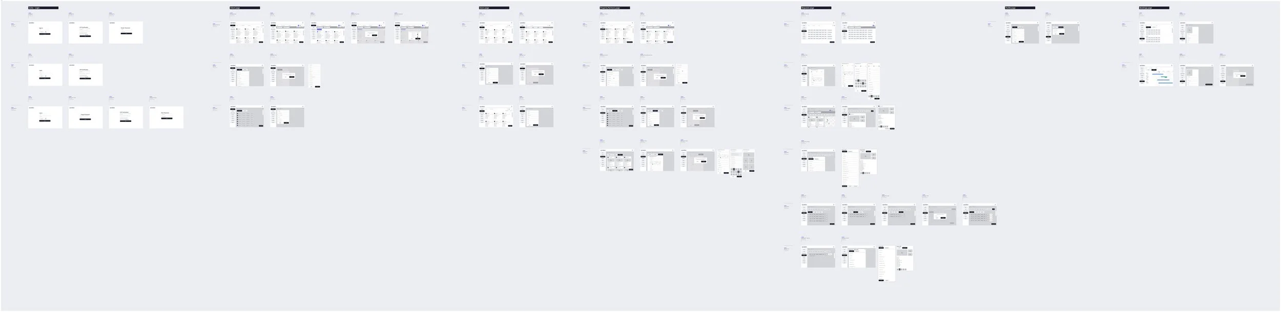
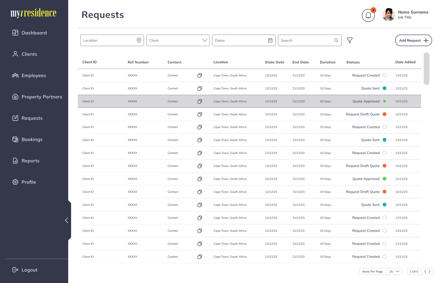
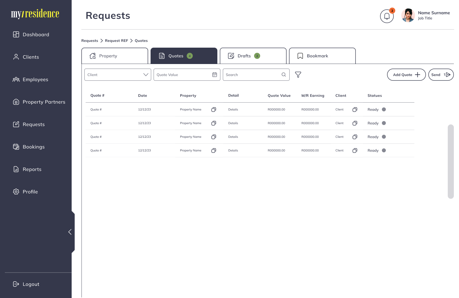
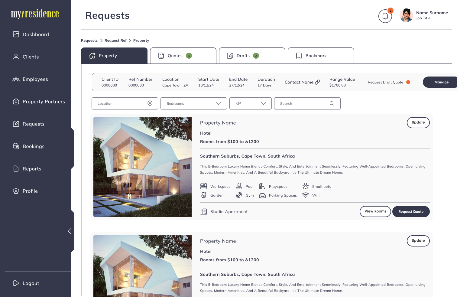
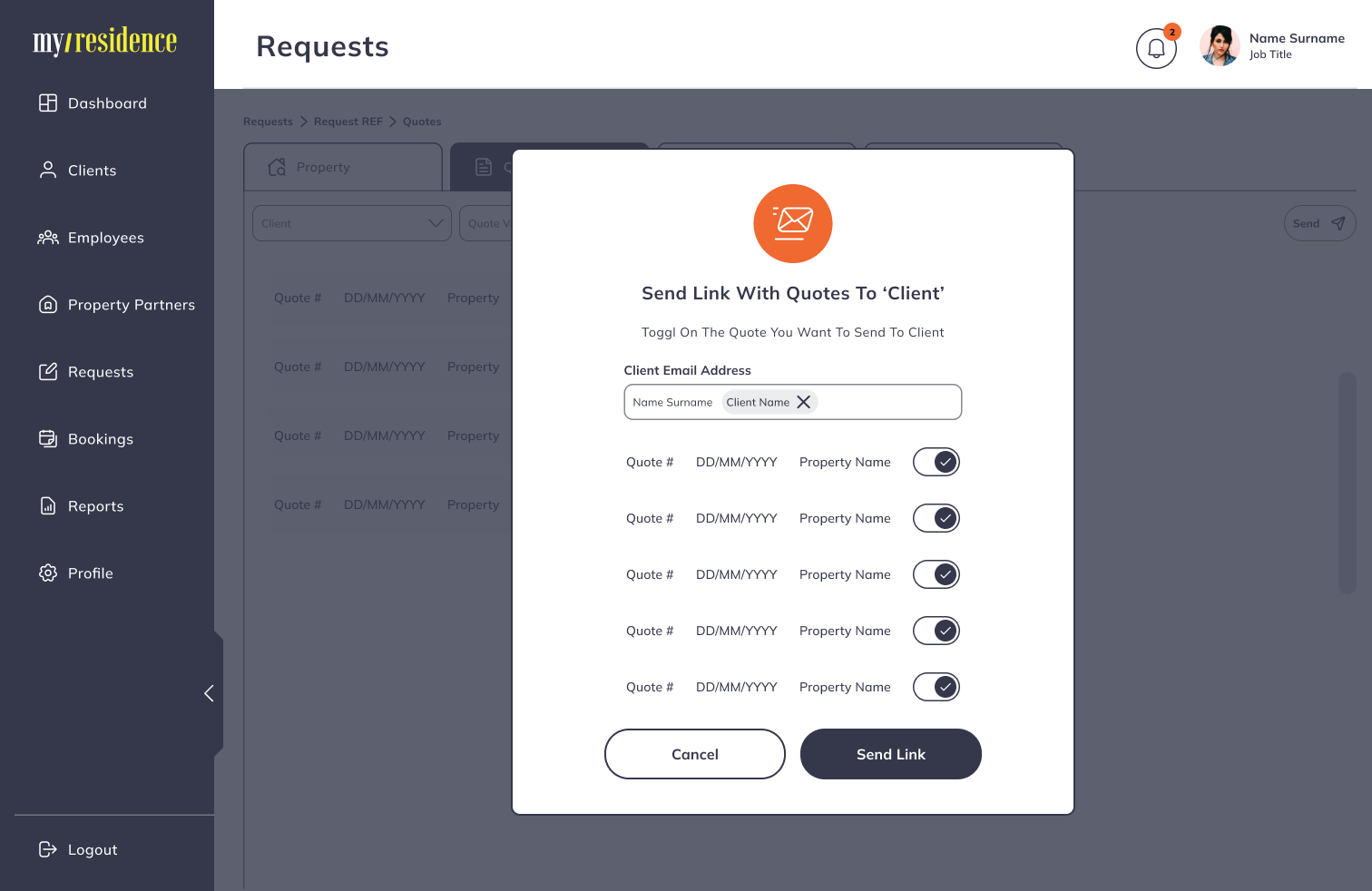
1. Strengthen information architecture
The platform needed a more intuitive structure so users could move easily between accommodation options, support services, documents, and communication.
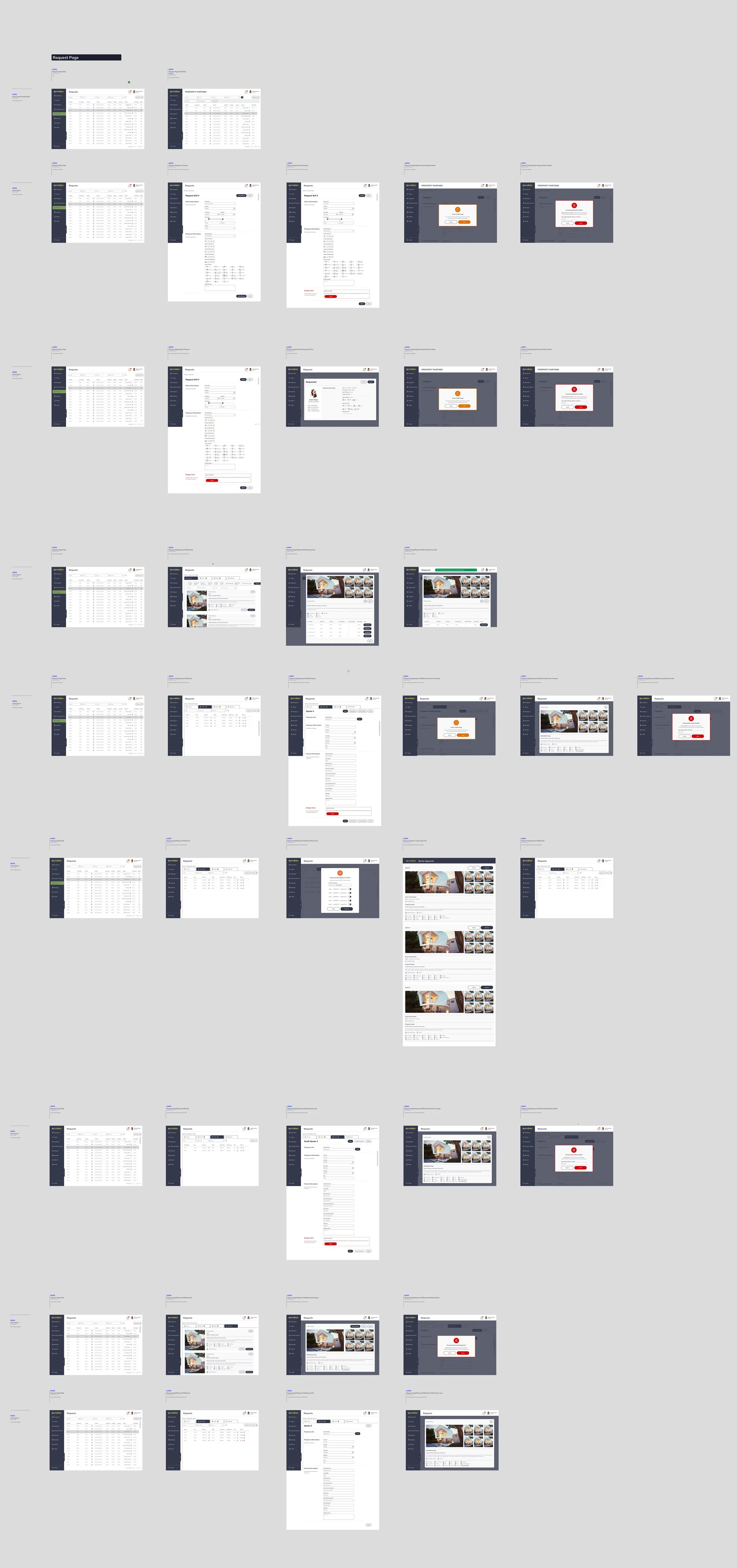
2. Reduce friction in key journeys
Booking and relocation journeys were simplified by making the next steps clearer, improving navigation, and surfacing the most relevant information at the right time.
3. Support trust through consistency
A stronger visual and interaction system helped the experience feel more dependable and more aligned across different parts of the platform.
4. Design for a service-led experience
This was not purely a property listing tool. The design needed to reflect a broader service experience, including local support, transport, onboarding, and practical relocation needs.
Solution highlights
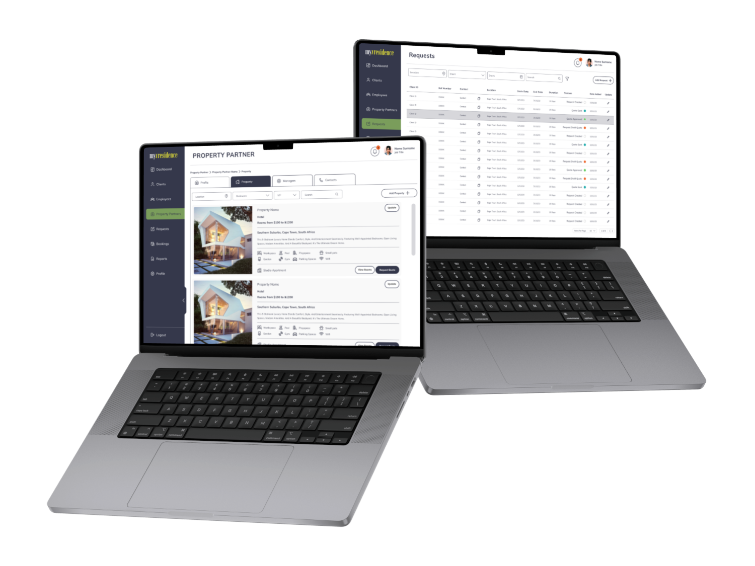
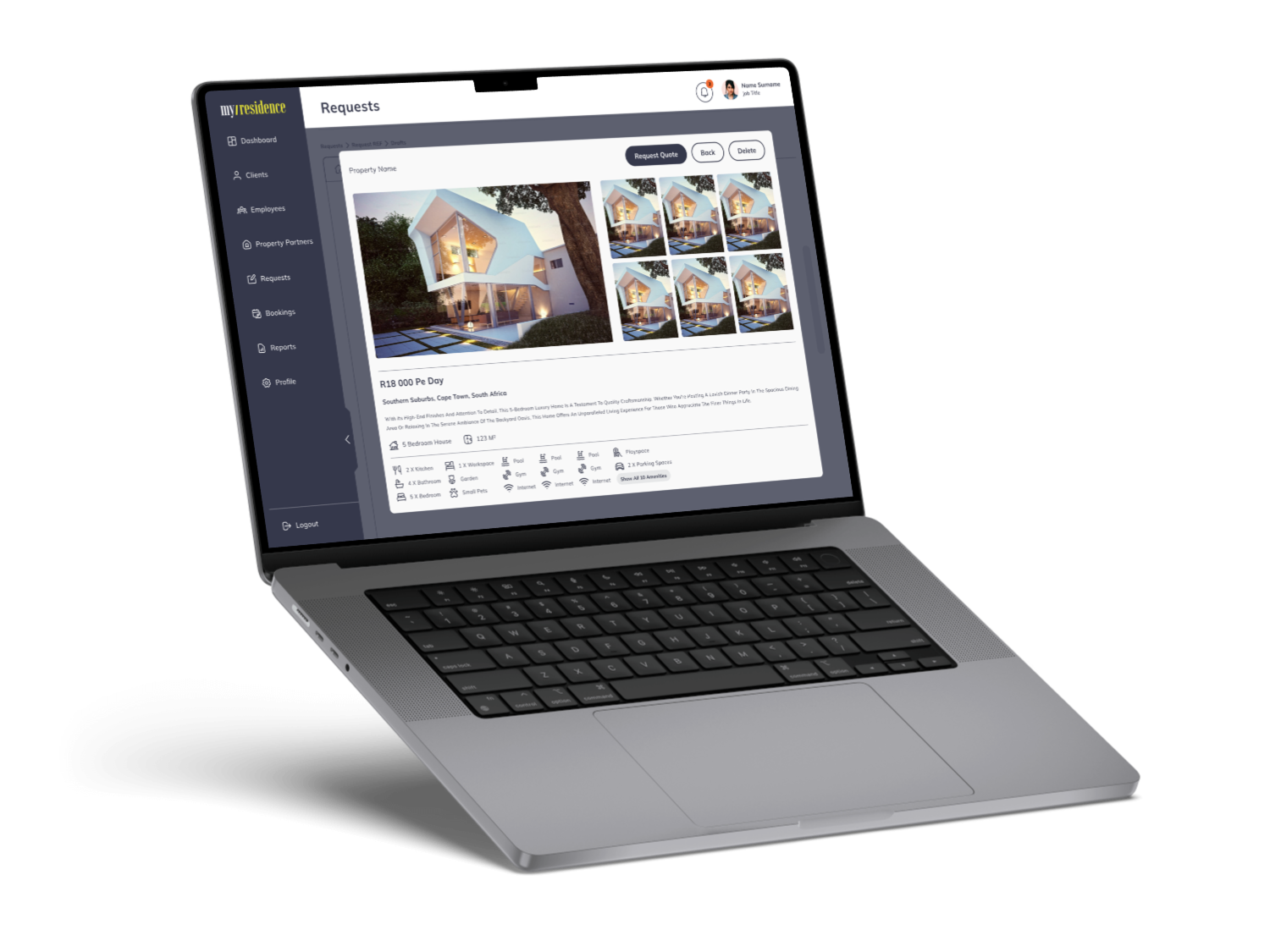
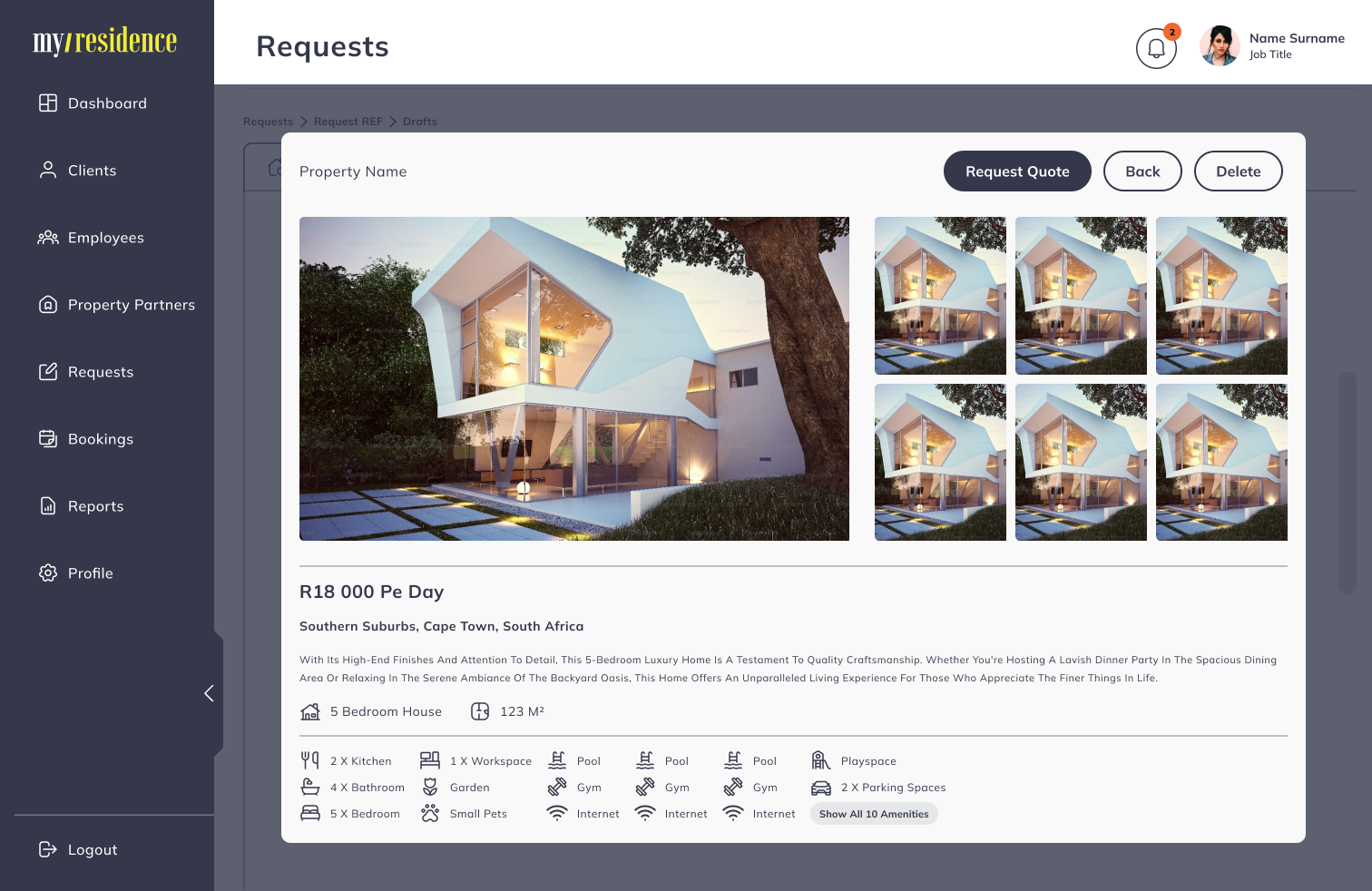
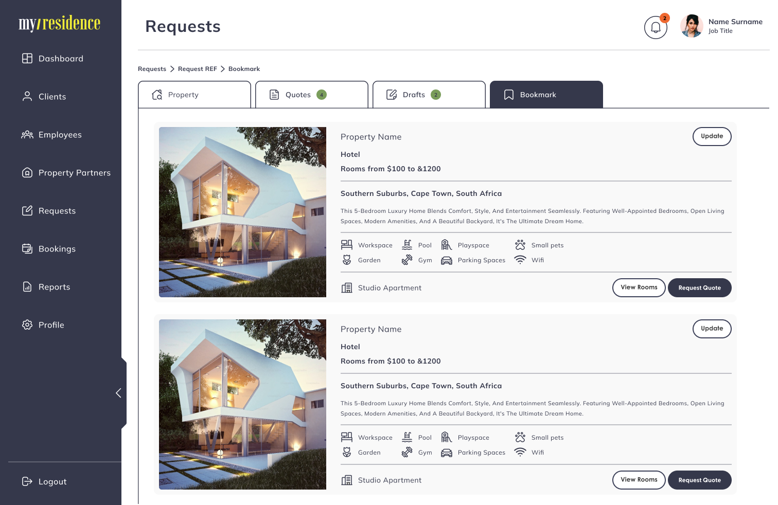
Clearer accommodation discovery
The platform structure was refined to make verified housing options easier to browse, compare, and understand.
Better support visibility
Support services such as orientation, airport transfers, and in-city coordination were more clearly integrated into the experience, helping users understand that accommodation was only one part of a broader service offering. The live page already highlights these as core value points.
Improved information flow
Content and actions were organised more intentionally to reduce overwhelm and help users focus on the most relevant tasks at each stage.
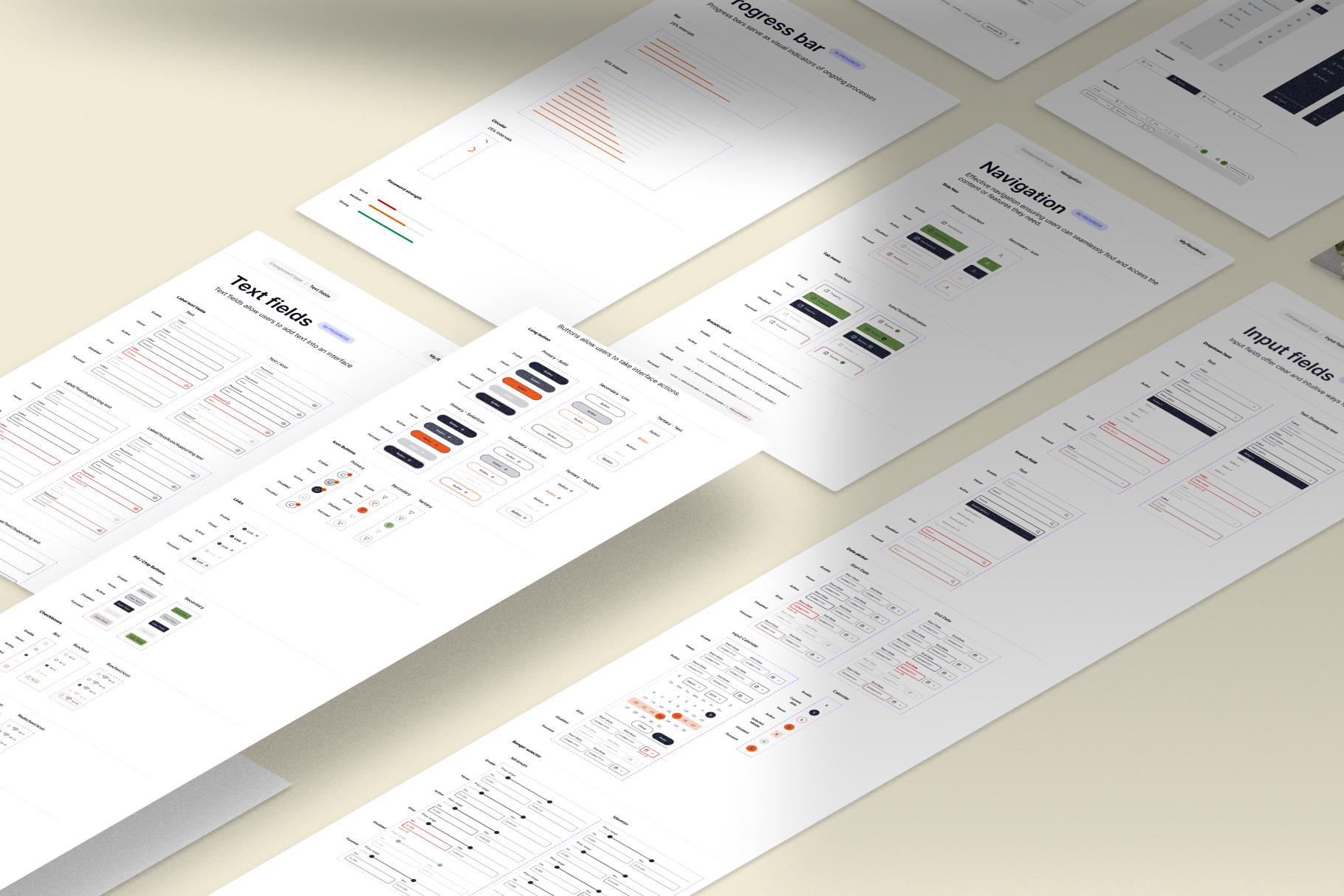
Consistent, scalable interface patterns
A more systematic UI approach supported usability, consistency, and easier platform growth across future features and locations.
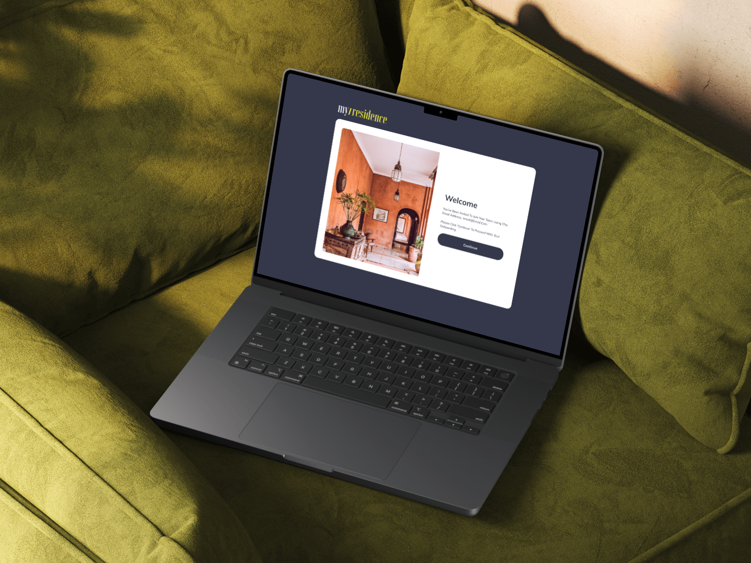
A more reassuring user experience
Because users were often navigating an unfamiliar environment, the overall design needed to feel calm, structured, and trustworthy rather than transactional or overly complex.
Design system thinking
A key part of the work was ensuring the platform could maintain consistency as it scaled.
This included:
More cohesive visual language
Clearer hierarchy across content and actions
Reusable interface patterns
Consistent navigation and layout behaviour
Responsive thinking across screens and devices
Design a foundation that could support future growth
Outcome
The result was a more structured and user-friendly platform direction for a complex accommodation and relocation service.
The redesigned experience helped create a stronger foundation for:
Navigating accommodation options with more confidence
Making relocation support easier to understand
Improving consistency across the service journey
Reducing friction in multi-step coordination tasks
Building trust in a high-stakes user experience
The current live page mentions improved retention, renewals, satisfaction, repeat bookings, and reduced relocation complexity.